I first encountered this type of illustration while reading the Wall Street Journal during my days studying at Pratt Institute in New York. Back then I had no idea what it was called or how it was done.
From Wikipedia:
Hedcut is a style of drawing, primarily of people, pioneered and used by The Wall Street Journal. The drawings are traditionally 18 by 31 Picas (3″ by 5.167″), and use the stipple method of many small dots to create an image. They are designed to emulate the look of woodcuts from old-style newspapers, and engravings on certificates and currency. The phonetic spelling of “hed” may be based on newspapers’ use of the term “hed” for “headline.”
So yesterday nostalgia struck and prompted me to search for a Photoshop plugin that can perhaps achieve a similar effect. Alas, after five years of not really waiting, no one has come up with anything close. My googling led me to the website of Kevin Sprouls, the man who started it all. Check out his site and this site and this one or grab an O’Reilly book at your local Barnes & Noble to get a feel of what the Hedcut style looks like.
I began tinkering last night with pretty good, but not perfect, results. I was thinking that maybe some famous political figure should be my first test subject. The first person I thought about? Russian President Vladimir Putin.
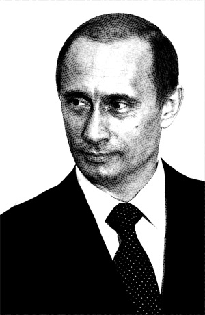
1. I’m going to start with an image that I pulled off of Google Images:
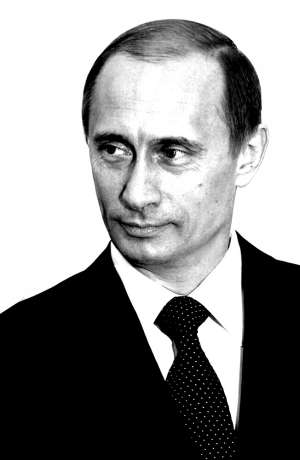
I chose this image primarily because it has a white background. It’s always easier to work with pictures with plain backgrounds especially if you want to edit only its subject. Note that this tutorial applies to black and white images. To convert a picture to black and white, click Image > Adjustments > Desaturate. If the picture doesn’t have enough contrast, click Image > Adjustments > Brightness and Contrast to increase contrast. To take advantage of the stipple effect, we need contrast to define the light areas from the dark areas.
2. Next, choose the Pencil tool and set the diameter to 5px and 100% opacity. Zoom in on your image to begin creating a set of dots. Our dots will each have a 5 x 5 pixel diameter and will be just 2 pixels apart. Depending on the size of your image, you may have to adjust the diameter and spacing.
![]()
To make things easier, keep duplicating layers until you’ve created enough dots to cover four times the size of your canvass.

For the sake of this tutorial, name this layer “Dots” and the other layer “Putin”.
3. With the Dots layer currently selected, click Filter > Distort > Wave. By doing this, we’re creating a more randomized pattern of dots that will help accomplish the stipple effect. Copy the following settings:

Click OK to apply the filter. Your image will look something like this:
If you find that the dots are too big, you may resize them through Edit > Transform > Scale. Be sure to press the Shift key to maintain proportion. I chose to scale down my dots by about 15%.
4. In the next step we apply a mask to the Dots layer to reveal only the parts of the dots that are shaded/darkened on Putin’s face. To do this, duplicate the layer with Putin’s picture and arrange it in this manner:
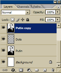
Apply a layer mask to the Dots layer by clicking Layer > Layer Mask > Reveal All. Select the Putin Copy layer and click Layer > Create Clipping Mask. This becomes the mask for the dots.
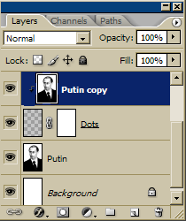
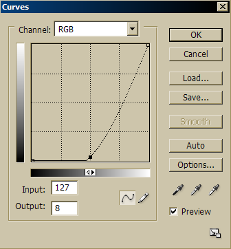
5. With the Putin Copy layer currently selected, click Image > Adjustments > Curves. Play around with the line graph and see the mask taking effect. These were my final settings:
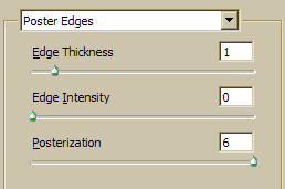
6. Now you’ll notice that the dots have somehow obtained a polygonal shape. What we really want are circular dots. To get around this, first merge the three layers Putin Copy, Dots and Putin through Layer > Merge Down or Ctrl-E. Then, click Filter > Artistic > Poster Edges.
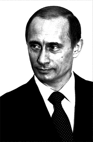
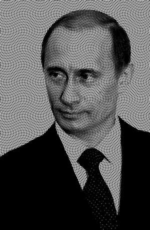
7. With a bit more tweaking, this is my final output:
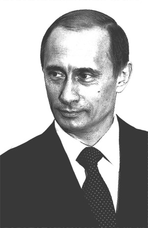
I increased the brightness just a bit and cleaned up the border mess caused by Poster Edges.
Sometimes it looks quite a bit mechanical because it was created through a computer which is unavoidable. But as you reduce the image size the dots become less obvious, making your work more convincing.
Download the source file (2mb) here.
Here’s more:
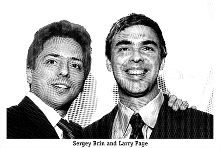
Google founders Sergey Brin and Larry Page: I used different patterns for the hair, face, body and background.
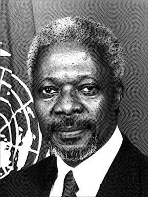
Outgoing United Nations Secretary-General Kofi Annan

Actress Angelina Jolie: This one I did to see if it would work on colored images. Apparently it does! It almost looks like it was hand-painted.
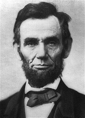
Abraham Lincoln: I decided to use lines instead of dots. The lines gave it a more vintage look, reminding me of the style of printed money.
Kevin Sprouls has a great talent. I relly like your tutorial as well. I think the affect is more apperant on his illustrations, but I think you could adjust the settings that you used depending on your output resolution and come up with some great results. Thanks!
Great little effect. I really like this, I’m trying to replicate victorian wood block printing and this is a real help. Thank you.
Augustine
Real great tutorial! Hot off the press! Gonna try it out now. Thanx!!
Excellent. I’ve always loved the look of 19th century engravings, and with a little tweaking I can now do a quick job of imitating them. Thanks!
This is very frustrating, b/c i’m fairly new to photoshop: I understand what a layer is, but you mention that we should duplicate the first layer of dots in order to avoid manually penciling in the dots over the whole image. But when i duplicate a layer enough times to cover the entire image i have almost 50 individual layers to then apply the filter to one-by-one…how did you manage to have all the dots exist in one layer?
Thanks for the help.
nice one….really needed this effect to incorporate in a brochure design…liked the methodology used in explaining…simple and straight to the point.good one…really appreciate it.
Just found this – wicked effect
I applied a green overlay layer with opacity of 30% to create a custom dollar bill of the missus.
Looks good.
Thanks
DM
doug: you can merge all the dot layers that you create to make just one layer.
to do this: link all the layers by clicking on the box between the ‘eye’ and the layer’s name.
merge all linked layers by pressing ctrl+e (or layer > merge linked)
you said you used lines instead of dots on the Abe Lincoln picture, are they the same height and width as the dots and seperated by 2 pixels? and say we have an image like 1024×768, so we need to compensate for this with a bigger line/dots? If so, by how much? Great effect, it’s going to be very useful
Great tutorial. Love how you explain the reasons behind what you were doing and not just the steps.
This is the best method I have seen for duplicating a hedcut in Photoshop.
Thanks!
Great tutorial. One suggestion instead of creating the Dot pattern by merging several layers. I used Nela Dunato’s suggestion and created a new pattern in Photoshop. Once your create a simple pattern you can use the paint bucket to fill the canvas!
Make sure the background color is transparent.
http://inobscuro.com/tutorials/read/10/
Thanks.
Uncanny how on time this was! A client was trying to explain the look he wanted for a label. I kept saying: Like a wood-cut block print? But he didn’t understand what that meant. And I didn’t know exactly how to do it.
And suddenly…
Thanks Drew
Great tute! just a quick point, rather than creating the dots by hand with a pencil you could define a pattern (6px x 6px with the 5px dot in the centre) and then just fill the whole page with that no?
oops! sorry I should have read all the comments shouldn’t I
Cool effect thanks! I actually pushed it one more step and added an angled stroke effect to the flattened image. This helped push that dollar bill engraved effect.
This is the coolest tutorial!!! thanks I have been loking for this effect many times!!! brilliant job!!
Thanks1! I was searching something like this very much time ago!
Angelina Jolie is BEAUTIFUL!!! I really like her -medard II
Hey Andrew
Thanks for the mention. I enjoyed your tutorial. I of course still produce my stipple, line art portraits and illustrations by hand. One dot at a time. I hope there remains a market for my “old school” style. Scanning these pen and ink illos creates photoshop issues of their own. It took quite some time to figure out how to eliminate the moray effect. Keep experimenting – its endless!
@Kevin: Whoa! Thanks for dropping by! I’m honored. The market for your hand-done illustrations will never run out. I’m just providing an easy way for digital artists and everyday people like me to achieve a somewhat similar effect. I appreciate your comments.
For step 2, working time can be shortened by defining a pattern which can be done by creating a separate document:
7×7 pixels document size
Background layer: Transparent
Use the brush to create a dot with 1 pixel of space around the sides and 2 pixels at the corners of the document, etc.
Nice tutorial!
Thanks for the tutorial. I have had some success tracing photographs, scanning them as greyscale images, then turning them into high resolution bitmaps. I took your ‘wavy dot grid layer’ and turned it into a custom pattern. When the bitmap dialogue box asks how it should pattern the black and white pixels, I select the pre-saved wavy dot custom pattern. Cheers!
No this is ***not*** the same as the arts in the Wall Street Journal. In there the pattern follows the 3-D shape of the head, and so enhances the sense of depth and sculpture. Your Putin got waves that run all the wrong ways.
Can you redo to make it look like 3-D arts? Maybe request PhotoShop to supply plugin for that purpose?
Be sincere man, you liked Angelina Jolie XD
Nice tutorial and nice effect.
I found it just trying to find something for gray scale printing, to make some comics. But i still wonder how to solve the big black patches on the image…
Whoa… i have been interested in the “WSJ effect” for quite some time. Never got around to doing anything… until now. This step-by-step process is VERY helpful. Spot on. Thanks so much for the effort of posting it so clearly.
I must be a dummy, but I cannot get this to work. I’m using Photoshop 6.0 for Windows and There seems to be no option that specifically says “Create Clipping Mask”. All I have is “Layer> Add Clipping Path > Reveal All or Hide All” and that seems to do nothing. Not sure quite what I’m doing wrong here.
Great looking result though on your images!
For those of you wanting the pattern to follow the contours simply create a displacement map from your desaturated image. Once you have saved the displacement map use the displace filter and it will follow the contours of the displacement map and look more like the wood etched / head cut / stipple effect.
Just create a new pattern. dont make those layers so much faster that way. tons of tutorials online.
Thanks for sharing this.
Just thought I would add this, though the thread may be dead (with the exception of stumblers)… I still cling to a copy of Pshop 5.5 (yes, run under Classic emulation!) because there are several old filters you just can’t find anymore, one of which is Flaming Pear’s “India Ink”…I dont THINK they updated it, would be happy if they did. It doesn’t replicate the results for this exact technique, but it often does a fine job of phaking hand inked look and feel from nicely contrasted photos.
You can still get it, but I think its from like 1992 so good luck running it unless you are really retro, or like me, have a legacy version of pshop or similar.
http://photoshop.pluginsworld.com/plugins/adobe/202/flaming-pear/india-ink.html
Hello! Great stuff but since I’m a rookie I would really appreciate a more detailed tutorial with screen shots. I really got stuck at step 2 (duplicating layers). Should I make the dots on the actual picture? How do I cover the entire surface?
I really want to grasp this method but it seems very difficult if new to Photoshop.
Thanks a lot!
Awesome tutorial, I completed it and I enjoy how my picture came out. Thanks!
Simply superb, i loved the angelina jolie’s effect the most, actually i am a great fan of her.
loveee<3<3<3
Very nice and clean effect… Really liked the colored jolie pic.. Just wondering if an action could be created to auto generate this beautiful effect…
I have spent hours trying to duplicate the hedcut technique in Photoshop. Some of my images are fairly good, but your technique is better. Glad to find your tutorial. It’s very kind of you to share your technique and the source file. Great work, thank you.
Okay, I’m using PSE 8.0 and I don’t see an “Adjustments” choice under “Image,” nor do I see anything that says “adjust curves” (apart from “adjust color curves,” which is very different from the dialogue shown and does not render the desired effect). Am I out of luck or is there a way around this?
Andrew: Your link to the source file is dead. Can you repost it, please?
Many, many thanks.
http://stat.alleba.com/download?file=http%3A//www.alleba.com/blog/wp-downloads/putin.zip
Hi Gus, apologies for that. You may download it directly from here: http://www.alleba.com/blog/wp-downloads/putin.zip